

COLOUR & MATERIAL MOODBOARD
Butter & Navy
A colour and material starting point for your home. Adapt this palette to the design direction, layout and finish level you prefer.

THE PALETTE, CONSIDERED
Making Butter & Navy work in your home.
Navy gives butter-cream walls and framed joinery a stronger contrast. Keep the darker colour concentrated in seating or selected cabinetry, with light textiles and clear moulding proportions preventing the scheme from becoming heavy.
The main image shows one interpretation. The same colour scheme can be expressed through different furniture forms, detailing and materials across other design directions.
- #F0E6C9
- #C4B18A
- #47566E
- #24354D
HEX values are screen references. Confirm paint, fabric and surface colours using physical samples before selection.
MATERIALS IN THE ILLUSTRATED EXAMPLE · KOSA-CL-05
Textures, surfaces and finishes.
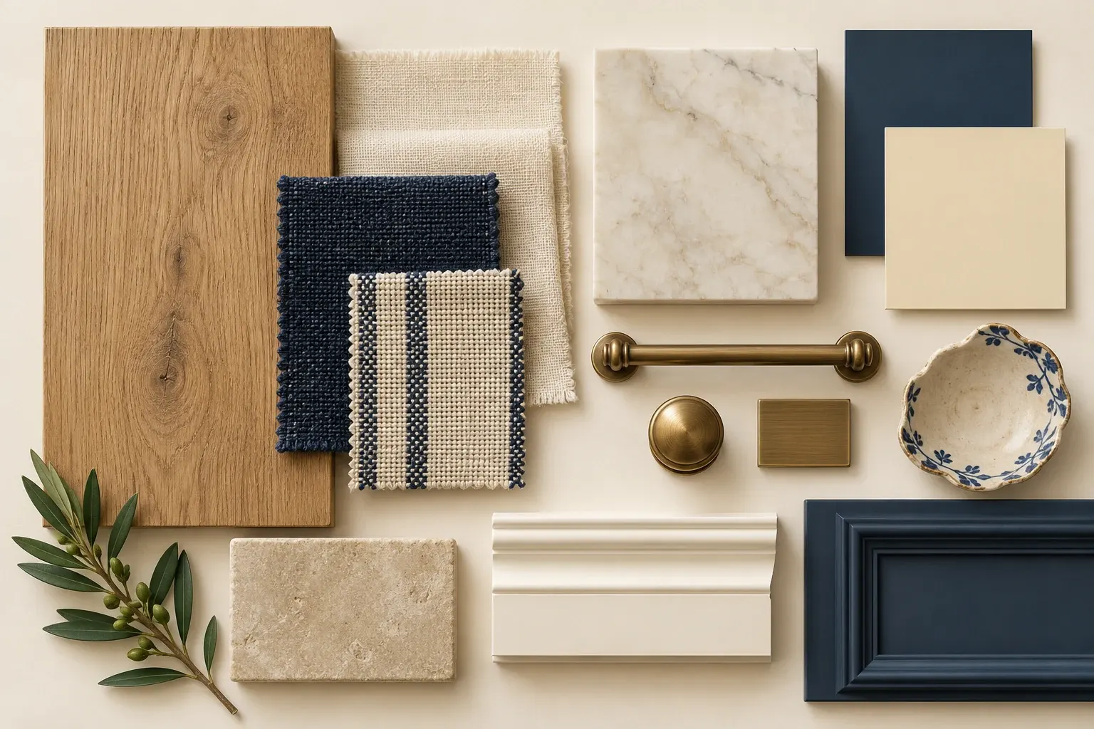
- Timber & joinery
- Warm oak
- Wall finish & colour
- Cream painted moulding & navy paint
- Upholstery
- Butter-cream linen & navy weave
- Curtains
- Tailored woven curtains, optional sheers and simple pleats
- Flooring
- Pale stone-look tile or selected oak-toned flooring
- Stone, tile & counters
- Ivory marble
- Metal & hardware
- Antique brass
- Rugs & small accents
- Textures and accent colours from Butter & Navy
These are design references, not a fixed specification. Final products, supplier codes, durability and maintenance are reviewed for your home.
ONE PALETTE. DIFFERENT SPACES.
The same materials, carried through.
See how Butter & Navy translates into the bedroom and living-room TV wall.
Bedroom
Butter-cream fabrics and a controlled navy accent carry the scheme into the bedroom, with warm oak and restrained wall mouldings.
Living-room TV wall
Cream framed wall details and navy accents give definition to the TV setting, while oak and antique brass keep it connected to the wider palette.
YOUR PALETTE. YOUR DESIGN DIRECTION.
Choose how to express it.
Colours do not lock you into a style. Explore the forms and details you like, then work with us to carry Butter & Navy into that direction.
EVERY HOME BEGINS WITH A CONVERSATION
Let’s talk about
your home.
Tell us what you have in mind. We’ll help you work out where to begin.
Discuss Your Space